The Code that Explained Social Distancing

In the beginning of March, Harry Stevens, a graphic artist and journalist with a background in UI design (User Interface) and the development of WEB, wondered if it is possible to use a segment of code that he wrote in the past, to explain the relatively new concept of social distancing that evolved during discussions about the new worldwide pandemic. At the time we had difficulty understanding social distancing and how it would help to reduce the spread of the pandemic or the "flattening the curve".
In order to explain the phenomenon of a virus like Corona spreading in an exponential manner, with or without social distancing or curfew, Stevens created a simulation of the Corona by using popping balls in different colors. They represented people who were either infected, healthy or that had just recovered. His article became one of the most watched reports in the Washington Post.
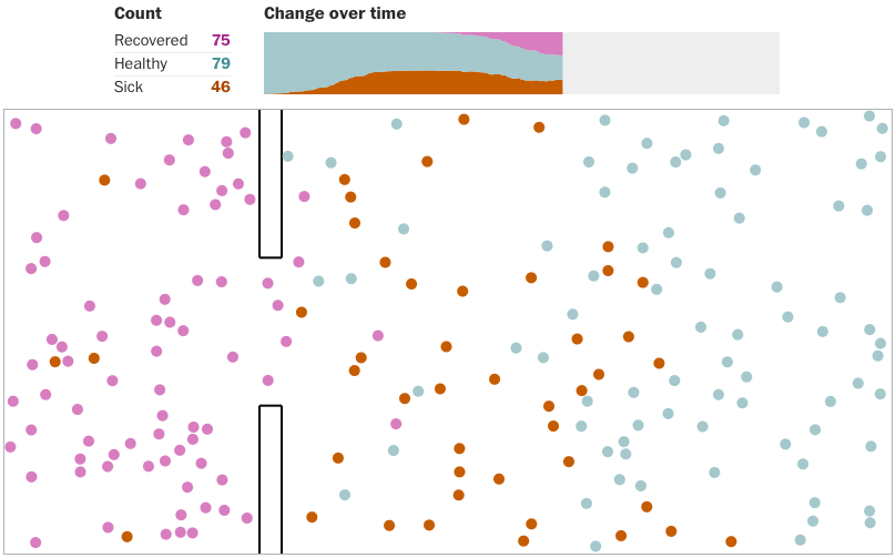
The balls move randomly, in the framework of "rules", representing each of the different conditions. After speaking with an expert, Stevens chose not to use actual information about the behavior of the balls and realizing that he needed super computers that know how to run mathematic models of big data. Nonetheless, the curve of the exponential growth of verified sick people in the USA was based on actual data from Johns Hopkins University and relates to the dates from the 22nd of January to the 13th of March, the date the report was published.
In different simulations, the balls showed that social distancing is the most effective means of prevention, even more than a curfew. Although based on incorrect data and without interpreting how the pandemic will develop, the report was read, mentioned and shared by politicians and celebrities along with ordinary people who saw it as a simple, clear and precise explanation. It was translated into 13 languages by volunteer writers, with the permission of the Washington Post. For many, it was a bright spot, a simple proof that in spite of the uncertainty we can change our behavior and thereby get better results.
The report is an excellent example of the designer's power to tell a story. In the Department of Visual and Material Culture we will examine ways of using digital technologies in design and art. We will discuss research, design choices, materials and tools that designers use in order to create stories that are influential, thoughtful, and that will motivate people.
Sarit Youdelevich
Lecturer in the Department of Visual and Material Culture